Del Monte Rebrand
Case Study
Del Monte is a North American food production and distribution company. Their purpose and idea is “Cultivating Quality” which means growing the best quality vegetables and fruits that provide valuable taste and nutrition to help you and your family lead your best lives. Their products mostly include fresh fruit as well as some pre-cut and pre-packaged items.
The main concept for the rebranding of Del Monte is to emphasize on the idea of sustainability but in a way that is educational. The company wants the consumer to feel as though they are contributing to the protection of the Earth in a way that is informative and friendly. An intelligent and contemporary new voice behind Del Monte that is friendly will draw in customers looking for healthy food options for themselves and their families.
PROCESS
Visual Planning
When conducting the research for this rebrand, the research process revealed Del Monte’s branding as slightly outdated and misses the opportunity to advertise the eco-friendly decisions they make behind the scenes. Collateral needs to contain contemporary and informative elements in order to open up more opportunities in other categories. Sustainable mission from website needs to be more prominent in their advertising. These considerations were addressed in the rebrand campaign.
Del Monte aims for older adults to middle aged customers from the ages 25-65 years. For the rebrand, however, a slight shift to a younger demographic might need to be considered (around 20-65 years)
For the rebrand, Del Monte’s Produce adopted three core pillars I am committing the company to live by. By focusing on these three attributes Del Monte is able to connect with their consumers in a way that has not been done before and have a more prominent and positive impact on their daily lives. Family, education, and environment are the three core pillars that guide them.
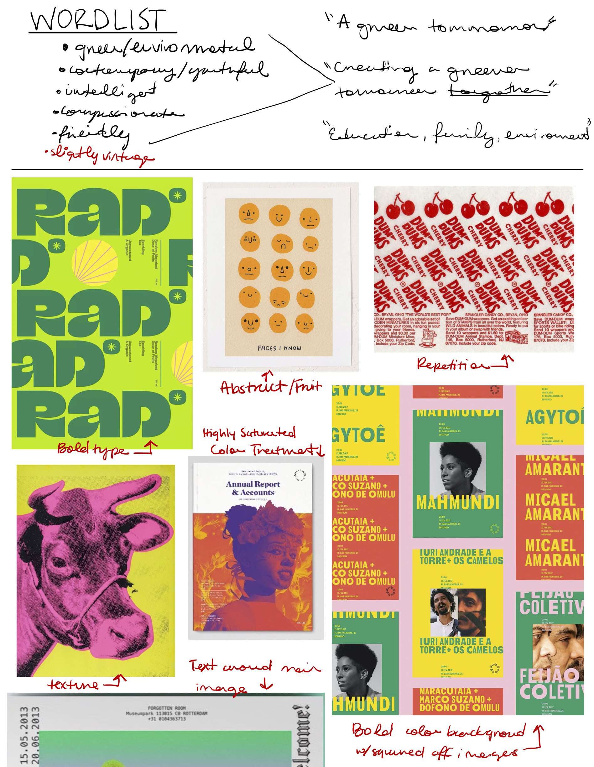
Wordlist + Moodboard
Logo
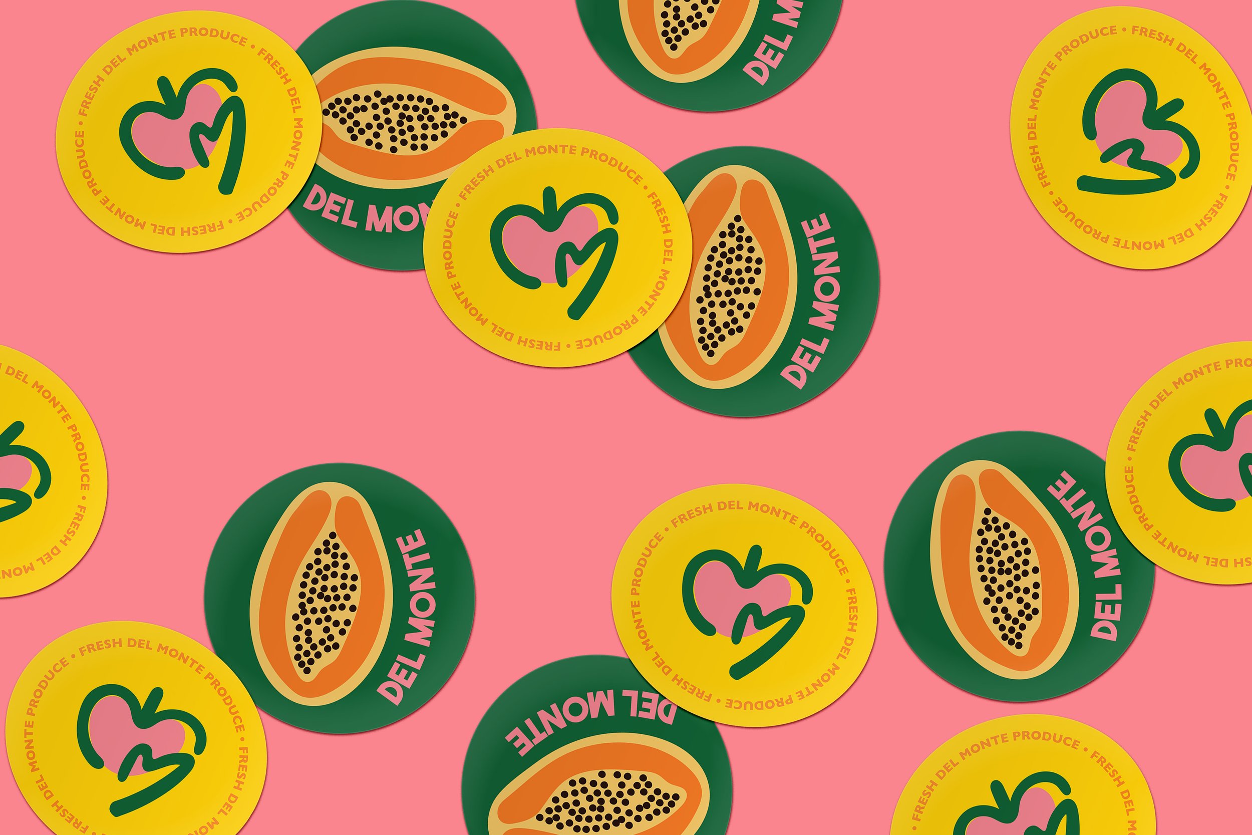
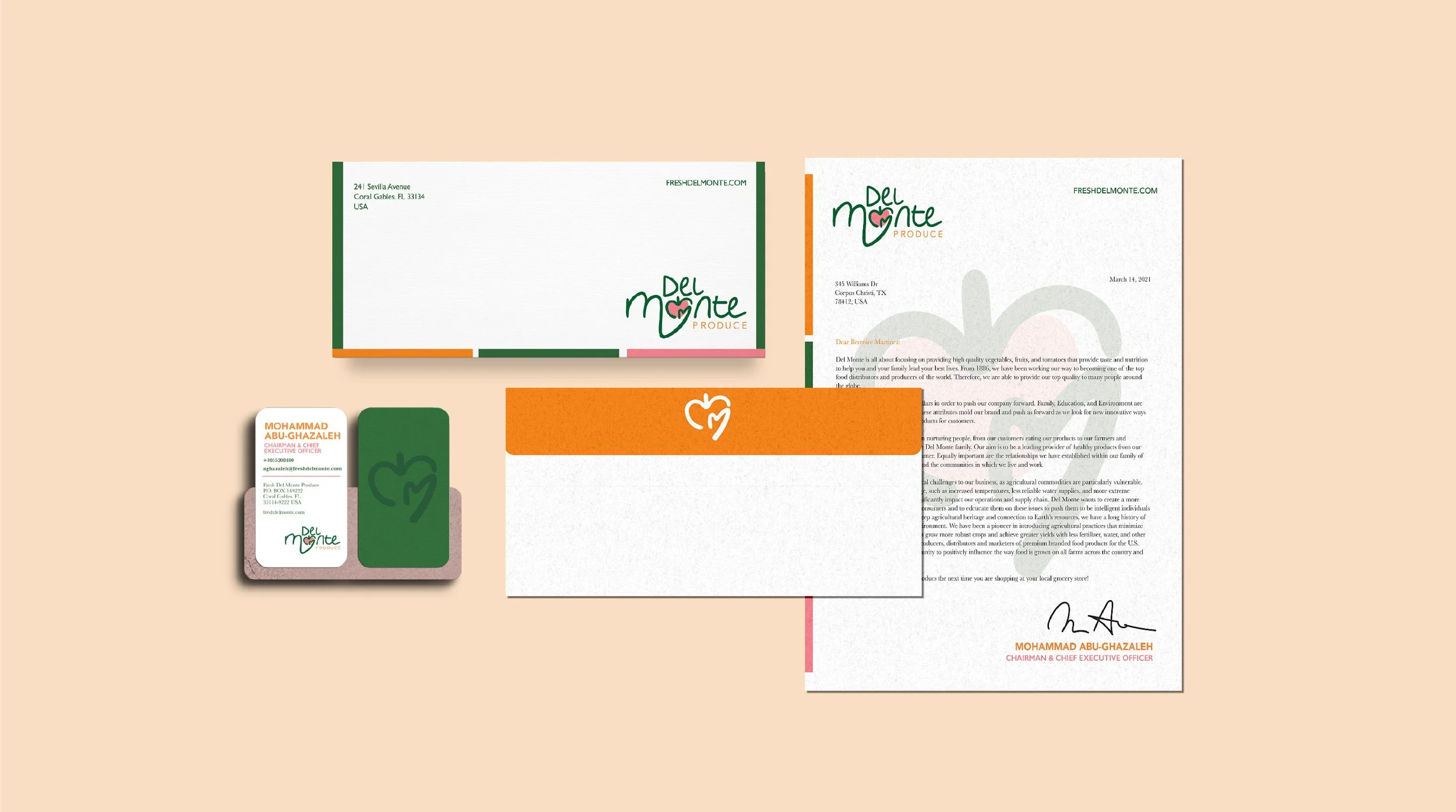
Del Monte’s new logotype remains a letter word-mark like the ones before; however, it has adopted a new organic feel. The hand written design ties into the natural and sustainable direction that Del Monte is trying to go in. The shape of the ‘o’ is that of a fruit and a heart to symbolize the health and family attributes Del Monte stands for. The hand holding the ‘o’ symbolizes that Del Monte is ultimately a company and brand that serves others. They are here to provide the best quality of foods in a way that is ethical and environmentally friendly.
Logo Sketches
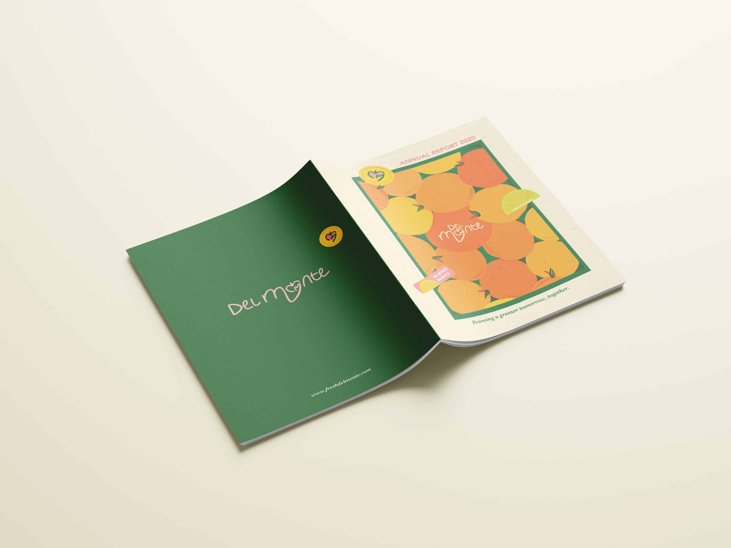
Annual Report
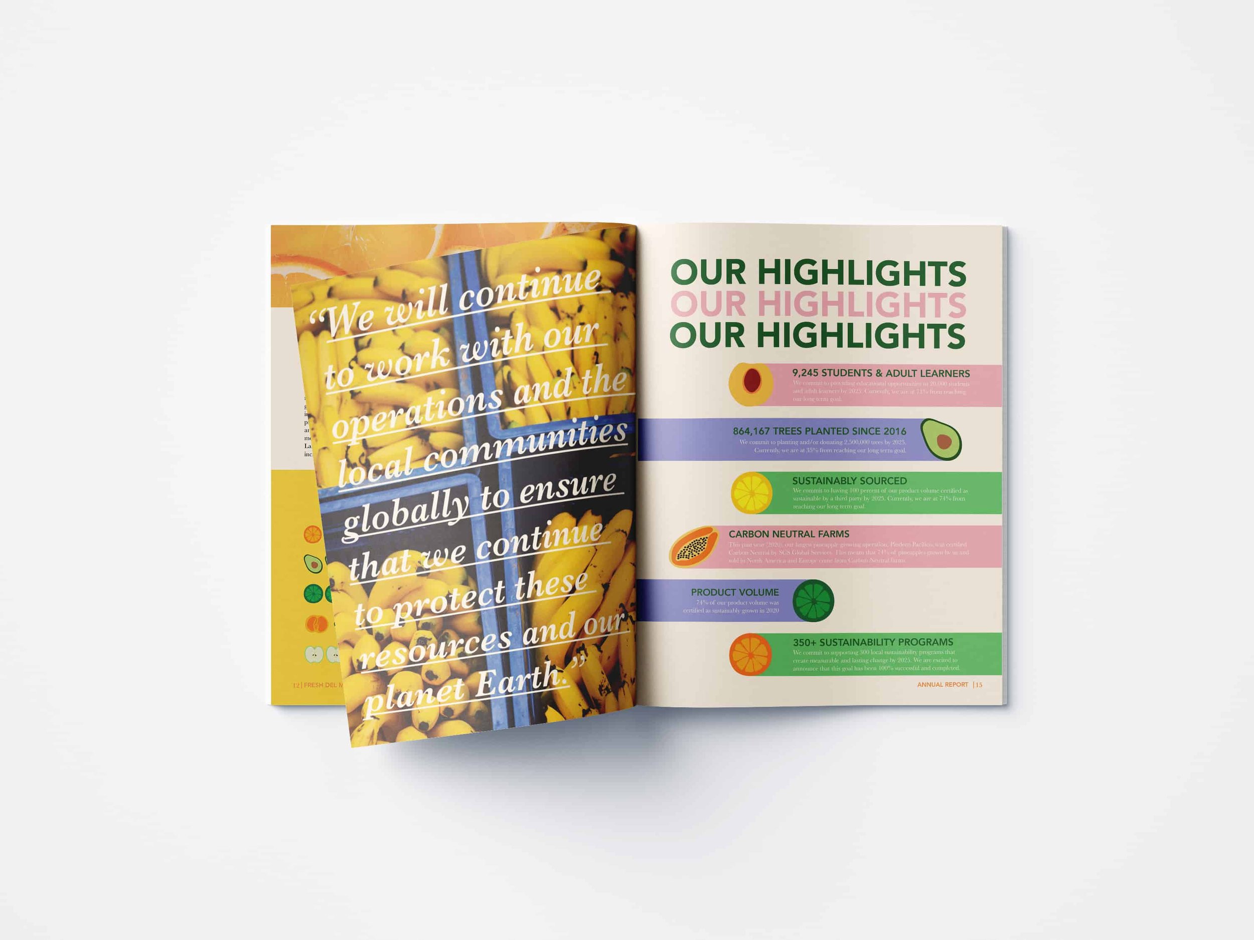
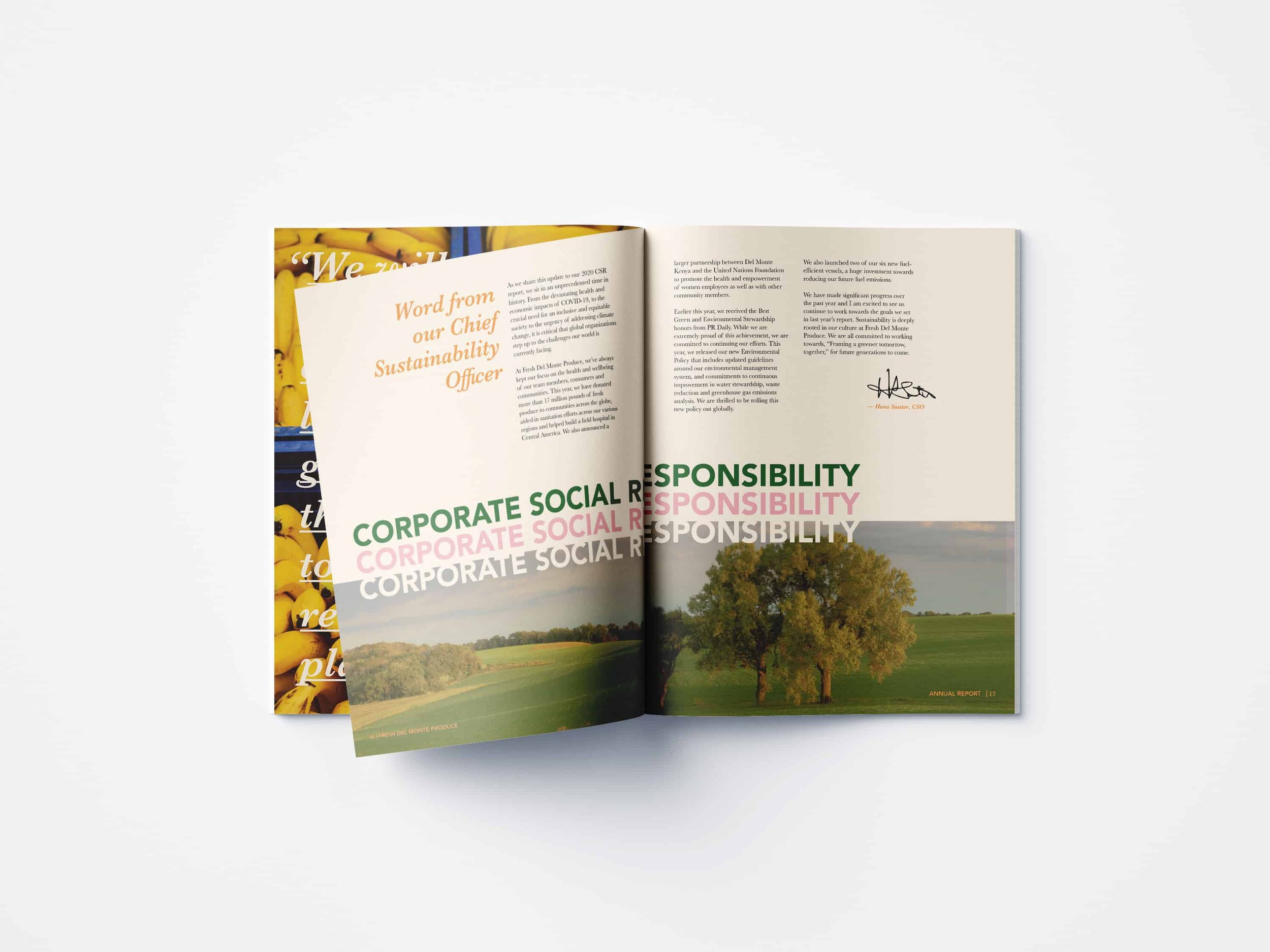
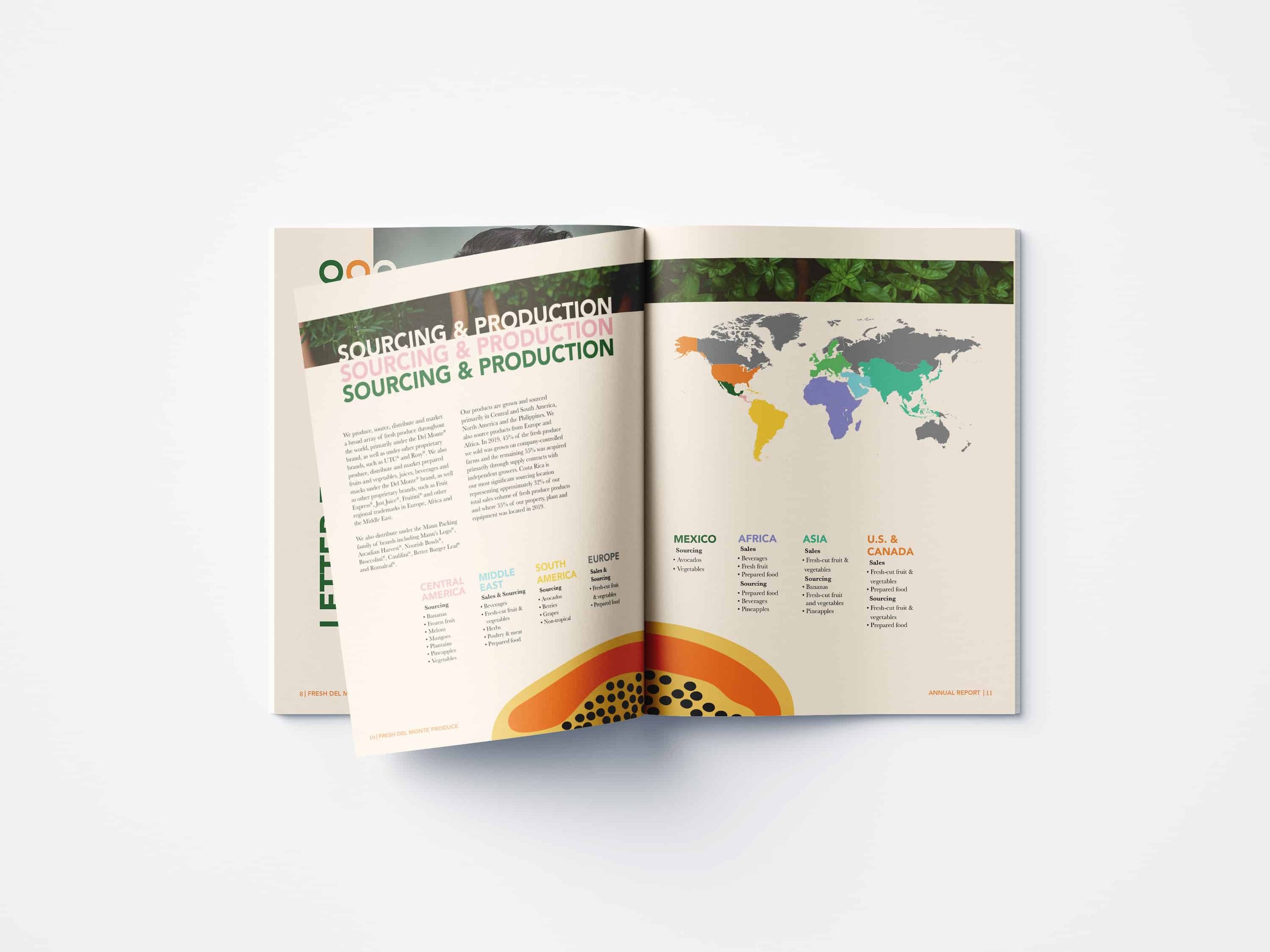
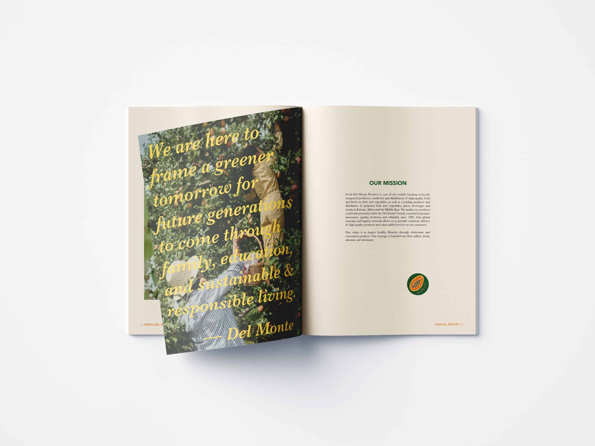
Fresh Del Monte’s 2020 Annual Report displays critical information to stakeholders in a open and contemporary manner. Each page contains important information that was carefully analyzed and revised to show the general public the behind the scenes of our company. They strive to build a strong connection with our consumer and that first step begins with transparency.
The annual report was designed with the idea of being photo heavy to show off the fresh products that Del Monte has to offer. Illustrations were added to give the overall report a friendly and approachable tone. Bold colors were used throughout the booklet to stay on brand and draw in possible stakeholders.
COLLATERAL
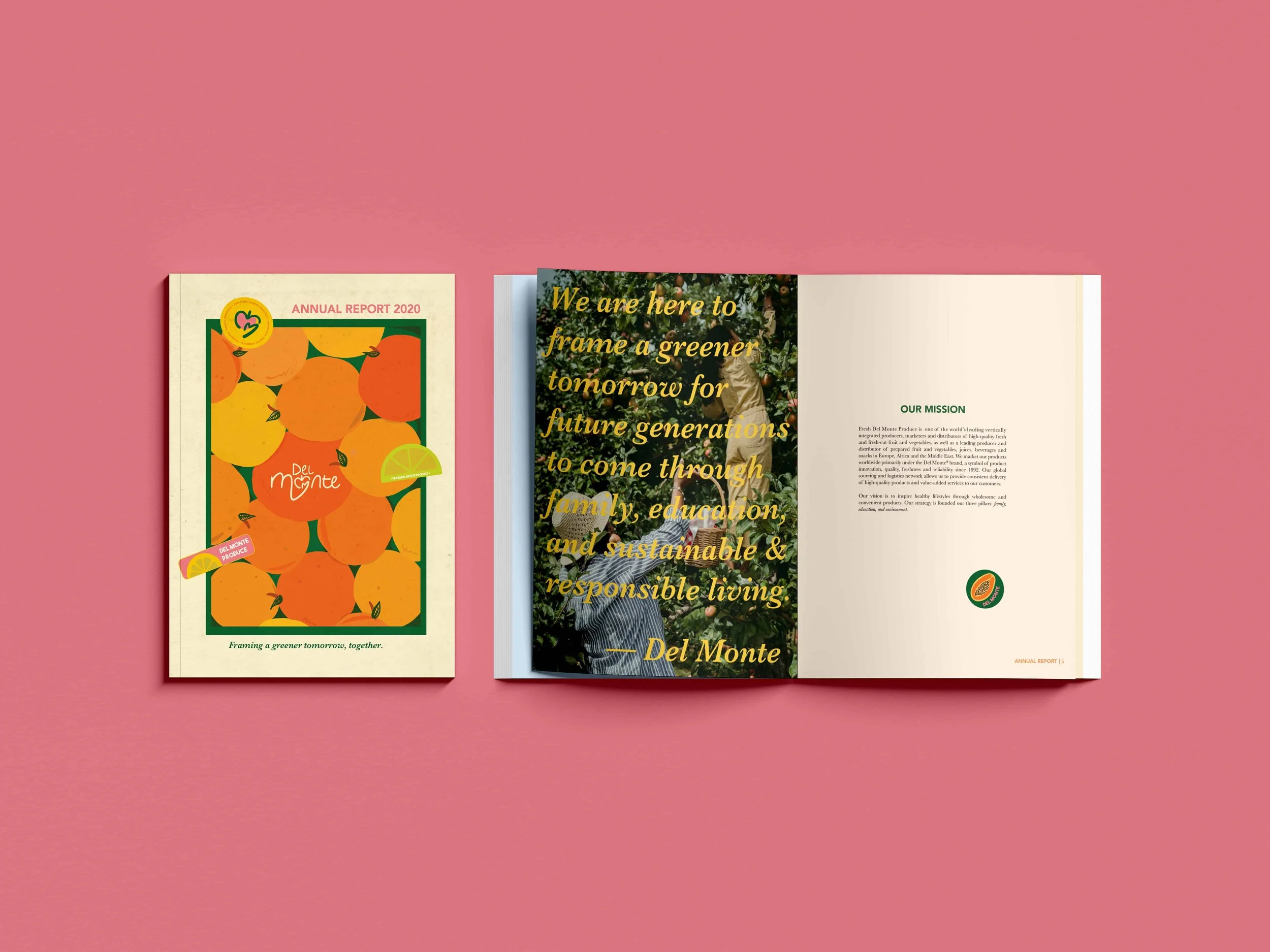
Del Monte Annual Report

Del Monte Distribution Truck

Del Monte Grocery Bag
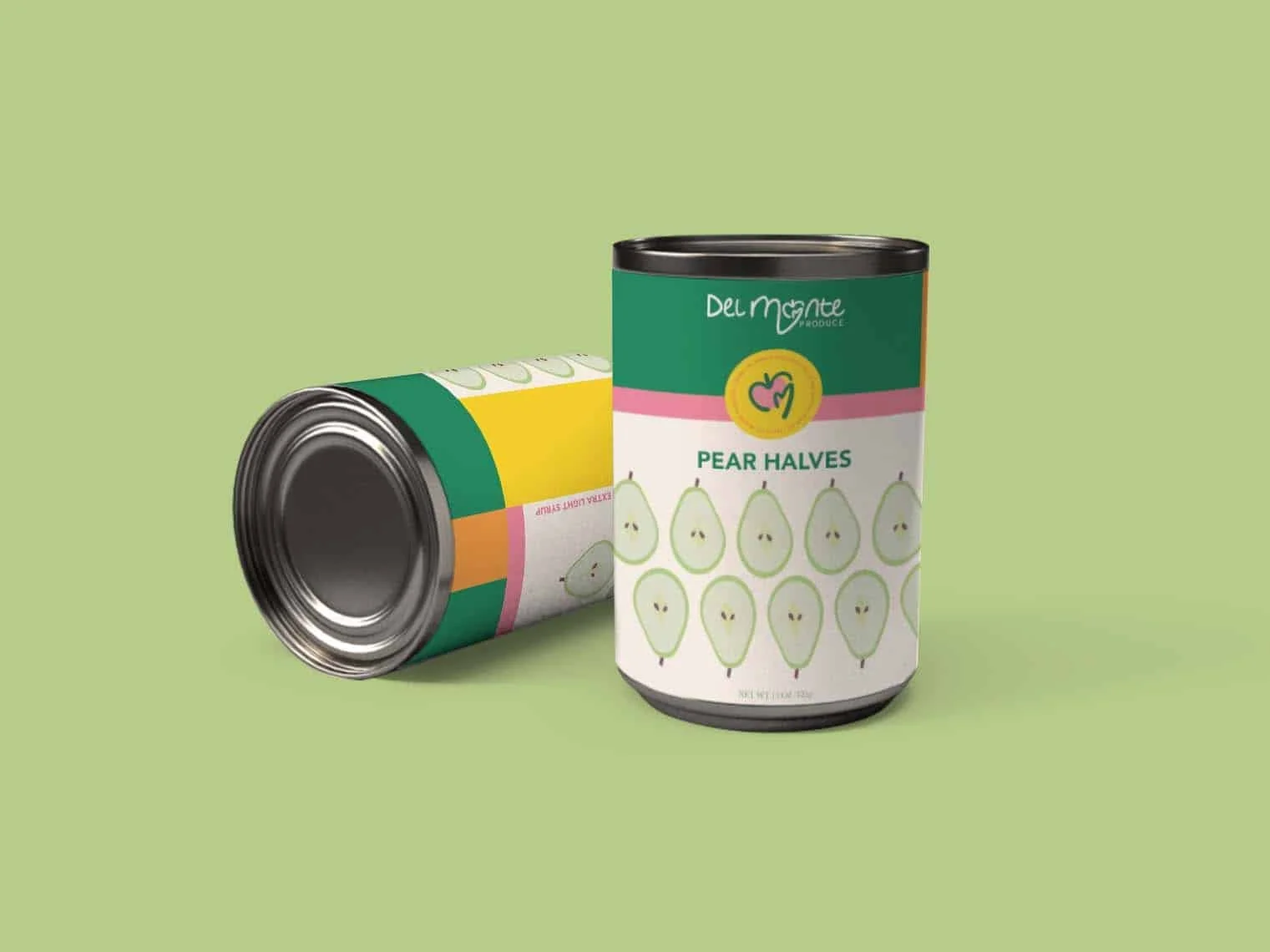
Del Monte Can Packaging

Del Monte Stickers